

Elevate
.png)
1. Overview
Project Overview
Elevate Bank is a responsive website concept designed to simplify personal banking by addressing common frustrations with traditional banking websites. By focusing on intuitive navigation, robust security, and accessibility for diverse demographics, including older adults, the project aimed to create a customer-first platform. This case study captures my journey of designing an accessible and visually engaging website that simplifies financial management for everyone.
01
Role
UX Designer
04
Location
Remote
02
Project Type
Hypothetical Case Study – Google UX Design Certification
05
Date
Sept - Nov 2024
03
Tools Used
Figma (design),
Miro (brainstorming),
Google Forms (research), Microsoft Teams (testing),
Notion (documentation)
Problem Statement
Many banking websites suffer from cluttered interfaces, complicated workflows, and limited inclusivity, leaving users, especially older adults, frustrated and disengaged. Elevate Bank needed a solution to make onboarding and account management intuitive and accessible while maintaining high trust and security.
Key Problem: How might we create a user-friendly banking website that caters to a diverse audience, fosters trust, and simplifies financial management?
2. Research & Goals
Research
To ensure the Elevate Bank platform addressed real user challenges, I employed a three-pronged research approach that combined user interviews, competitor analysis and persona creation. This method provided valuable insights into user pain points, accessibility needs, and opportunities for innovation. The diagram below outlines the research methods I used to build a strong foundation for the design process.
.png)
Step 1: User Interviews
I conducted interviews with 9 participants aged 25–70, selected to represent a diverse range of banking users, including working professionals, retirees, and young adults. The goal was to explore their experiences with current online banking platforms, focusing on challenges, frustrations, and expectations for a better solution.
Type: Semi-structured user interviews
-
I prepared 8–10 open-ended questions to guide the conversation while allowing flexibility to uncover unique insights.
-
This approach provided a mix of structure and spontaneity, ensuring a deep understanding of user needs and expectations.
Participants: Included friends, colleagues, and family members with varying levels of comfort with technology, ensuring a representative sample of both tech-savvy and less experienced users.
Key Findings:
Inclusivity and Accessibility
Older adults and less tech-savvy users found online banking unintuitive, with features often hard to locate (6/9 participants).
Confusing Navigation
Cluttered layouts, too many tabs, and frequent UI changes left 8/9 participants frustrated.
Lack of Support and Security
Poor support left 7/9 participants feeling stuck, while weak security measures like DOB and email caused concern.
Overcomplicated Workflows
Lengthy workflows like account setup led 6/9 participants to abandon tasks.
After speaking with participants and uncovering their frustrations and needs, I wanted to understand how existing websites were tackling these challenges. Diving into competitor analysis gave me the opportunity to see what features were working well and where they fell short
Step 2: Competitor Analysis
To identify opportunities for improvement, I analyzed three major banking platforms—Bank of America, HDFC Bank, and Lloyds—and compared them against the vision for Elevate Bank. This analysis revealed gaps in usability, accessibility, and features that informed key design decisions.
.png)
Insights from Competitor Platforms
Accessibility Gap: All competitors lacked robust accessibility features, making navigation difficult for older users.
Confusing Interfaces: Overwhelming layouts and cluttered designs made tasks frustrating for users.
Weak Visual Guidance: Minimal use of dynamic visuals, such as progress bars or tooltips, left users unsure of what to do next.
Limited Comparison Tools: Only Lloyds offered basic account comparison, but it lacked depth and clarity.
With user feedback and a clear understanding of where competitors were missing the mark, I wanted to validate my findings with a larger group. This led me to create personas to bring the data to life.
Step 3: Persona Creation
Using insights from user interviews, I created a detailed persona to represent Carla, a key user type Elevate Bank aims to serve. This persona captures her behaviors, motivations, and challenges, providing a foundation for user-centered design decisions.
Objective:
-
Present a clear understanding of Carla's banking frustrations and goals.
-
Highlight how her persona and journey map guided key design choices.
-
Identify opportunities to create a more intuitive and inclusive banking experience.
Persona: Carla

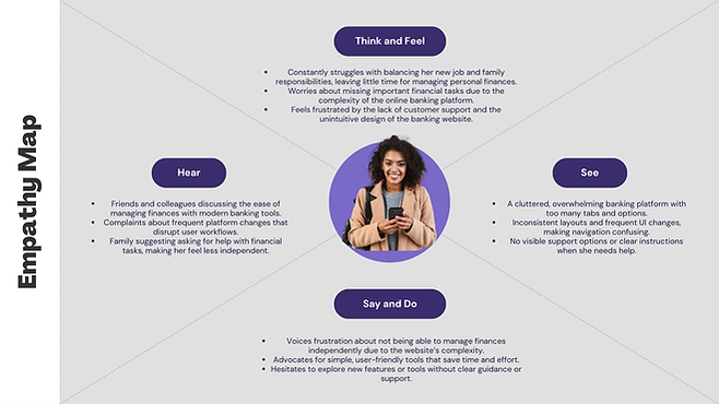
To dive deeper into the users' experiences and emotions, empathy maps were created for each persona, offering valuable insights into their thoughts, feelings, and challenges
.png)
To further visualize the users' interactions with networking resources, journey maps were developed. These maps highlight key steps, pain points, and opportunities for improvement, ensuring a comprehensive understanding of their journey
.png)
This persona and their journey provided a clear lens to identify critical pain points and user needs, forming the foundation for the Goals and Objectives of Elevate Bank’s redesign
.png)
3. Design Proces
From
Insights
Design
Using the insights gathered from user interviews, Carla’s persona, empathy map, and journey map, the design process for Elevate Bank began with one clear goal: creating a secure, intuitive, and inclusive online banking experience. The journey started with low-fidelity sketches to map out workflows, transitioned into detailed wireframes, and culminated in polished high-fidelity prototypes. At every stage, usability testing was conducted—first to refine navigation and core features, and later to validate the design’s alignment with user needs and expectations.
1. Paper Wireframes
The design process began with hand-drawn paper wireframes, where I focused on translating initial ideas into basic layouts and flows. These sketches were an essential starting point, allowing me to explore the website's core features and overall structure while keeping things flexible and iterative.
The following screen features were sketched:
Homepage dashboard: Introduced an intuitive homepage with various tabs and options to navigate.
Account Comparison: Side-by-side comparison layout for different account types, enabling informed decision-making.
Onboarding Process: Step-by-step account setup screen with progress bars to guide users through the process.
.png)
2. Low Fidelity Prototype
Once the paper sketches felt solid, I moved them into Figma to create the low-fidelity prototype. This phase was all about structure and functionality—getting the user flow right before diving into aesthetics.

Lo-Fi Prototype – At a Glance
In the low-fidelity stage, I expanded on the paper wireframes by:
Refining Navigation Flows: Streamlined transitions between homepage, onboarding, and dashboard screens.
Enhancing Onboarding: Broke down account setup into guided steps with progress bars.
Improving Dashboard Usability: Centralized quick actions and decluttered secondary features
Prototyping Interactions: Linked screens for usability testing and ensured placeholder content mimicked real interactions.
3. Usability Testing - Round 1
I conducted usability testing with 4 participants, including professionals and retirees, to validate Elevate Bank’s navigation and core features. The sessions focused on tasks like onboarding, comparing accounts, and managing transactions, revealing key areas for improvement.
Key Findings:
-
Onboarding Steps Worked Well: The progress bars were clear and helpful.
-
Dashboard Felt Overwhelming: Users suggested simplifying the layout.
-
Navigation Labels Were Inconsistent: Some terminology caused hesitation.
-
Account Comparison Was Effective: Users found it intuitive and informative.
.png)
4. High Fidelity Prototype
After addressing feedback from usability testing in the low-fidelity stage, I transitioned to creating a polished high-fidelity prototype for Elevate Bank. This stage focused on refining the visual design, enhancing functionality, and incorporating interactive elements to provide a seamless and professional banking experience. Here’s what the high-fidelity prototype focused on:
.png)

Hi-Fi Prototype – At a Glance
In the high-fidelity stage, I built upon the insights and refinements from the low-fidelity prototype by focusing on both aesthetics and functionality:
Crafting a Trustworthy Visual Identity
Designed a cohesive, modern color palette inspired by professionalism and trustworthiness, with shades of blue and slate. This created a clean, user-friendly interface aligned with Elevate Bank’s mission.
Refining Navigation Flows
Improved menu hierarchy and button placement to make transitions between screens (like onboarding, transfers, and comparison tools) smoother and more logical.
Enhancing User Interaction
Integrated interactive features, such as dynamic account comparison tables and real-time updates, to keep users engaged and informed.
Improving Accessibility
Implemented accessible design features, including larger buttons, high-contrast text, and responsive layouts for all screen sizes.
5. Usability Testing - Round 2
To validate the final design, I conducted a second round of usability testing with 6 participants, including professionals and retirees. The goal was to assess both the visual and functional aspects of Elevate Bank’s platform, ensuring the design aligned with user needs and expectations.
Key Findings:
-
Navigation Was Clear and Effective: Participants found the navigation intuitive and easy to use, with only minor suggestions for slightly larger buttons on mobile.
-
Onboarding Flow Was Smooth: Users appreciated the guided steps and progress indicators, though a few suggested combining some steps for faster completion.
-
Account Comparison Was a Highlight: Participants loved the clarity and ease of comparing accounts and suggested adding a toggle for additional details.
.png)
4. Final UI
Key Changes and Features
The table below highlights the most significant improvements made in the Final Design, showcasing how each update addressed user challenges and enhanced the overall experience.

Key Performance Insights
-
Post-Test Satisfaction: Over 92% of participants rated the final design 5.5/6 or higher for usability, visual appeal, and functionality.
-
Improved Task Efficiency: Average task completion time decreased by 30%, reflecting smoother navigation and simplified workflows.
-
Error Reduction: Critical errors dropped significantly from 10% during low-fi testing to just 3% in the final design.
Final Designs - Slideshow
Please press the left/right arrows to scroll between Elevate's Final UI screens


Introduction
The transition from low-fidelity prototypes to high-fidelity designs was a pivotal step in shaping Elevate Bank into a user-friendly, secure, and visually appealing platform. Guided by usability testing insights, the final design addressed key user pain points, such as navigation complexity and lack of clarity in workflows. This stage merged functionality with modern design principles to deliver an intuitive and inclusive digital banking solution.